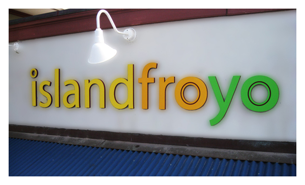
We do a lot of HDU foam letters now that we have our CNC router and these latest set are for a new frozen yogurt business on the other side of the island called Island Froyo and will be painted and mounted to a concrete wall.
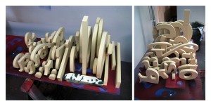
The logo art for Island Froyo was given to us by the client’s designer and we soon made appropriate adjustments as to make readability/visibility easier as well as making it easier to produce using our router. Once the logistics were worked out, we cut the lettering. Most of the letters were cut in reverse (face-down) so we could also pre-drill the stud holes in the backs of the letters during routing.
The three circular shapes (two “o” letters and the dot of an “i”) were cut face-up because they also had secondary dimensional grooves cut in the faces; the stud holes on these were hand drilled. Before the letters could be painted, they were washed and rough edges were slightly sanded.
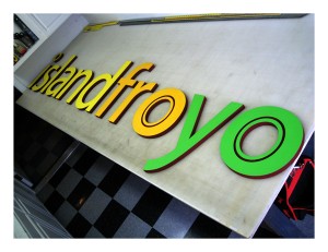
Before painting the sides and backs on the letters the designated burgundy color, we rolled out transfer tape down on the table, sticky-side up. This insured that the letters would not move during painting, which was applied via spray gun. After a few light but even coats, the backs and sides were painted and the letters could be flipped over where rolling the fronts could be done.
The design called for three different colors, yellow, orange and green and, again after multiple even coats, the front surfaces were complete with the exception of the aforementioned grooves in the circular shapes. These shapes were masked-off and the same burgundy color was applied to the grooves with a spray can, as opposed to traditional spray gun.
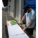
Before installation we made pre-install template that could be used for making accurate holes in the concrete wall that correspond with the stud holes drilled in the backs of our letters. Taking a piece of scrap wood that fit the dimensions of our fully arranged lettering and a pen plot stencil of the full-size lettering we drilled the holes through both the stencil and the wood template so installation would be simpler, especially since we needed to rent a boom-lift to reach the section of the wall where the letters would be going. After making the template, we were off to install.
 The morning we set off to the other side of the island for our install it was raining considerably. The boom had been placed there the previous day and we did everything we could to set up in the rain short of getting on the lift with the letters and then we waited for the rain to stop. Shortly after sunrise, the rain did stop and we proceeded with the installation.
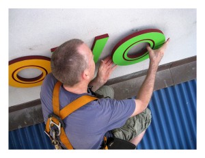
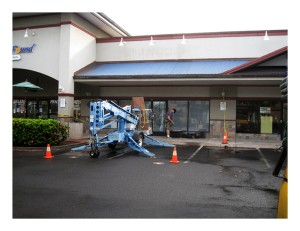 After we got used to the maneuvering abilities of our boom, we easily arranged ourselves safely but effectively in front of our wall to begin to lightly clean the wall, set our template and drill our holes into concrete. Once the template was set and the holes drilled, setting the studs into each letter (while on the ground) and adhering the already set studs into the concrete wall was the easiest part of the job, except for the part where we were twenty feet above the ground in a metal basket.
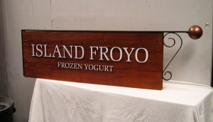
 The last portion of the job was actually completed a week or later with the designing and creation of a blade sign that had to be recreated to match the styles of the existing blade signs in front of the other stores in the mall complex. This was sandblasted redwood and later stained with a deep red sealant and the upraised letters painted white.

 Posted on December 1, 2010
 by islandsign
  0
0 