I am going to document the steps of this design because I feel that the process was somewhat typical, and may be of interest to some of my readers, or helpful for me to share with other potential logo design clients.
This client came in while on a week long visit from Arizona to research the conditions for his new Kayak tour company he was planning. He commissioned me to design his logo, & hoped to have several vehicles for me to do within the following month or so. He had a hat he liked with a petroglyph of a figure & lettering circling around it. He liked the hat design, but he didn’t want the business name circling the graphic, just some words to help convey the image of his business, with the name to appear off to one side. He gave me a design deposit, & flew back home.
This was the first set of drawings I sent him:
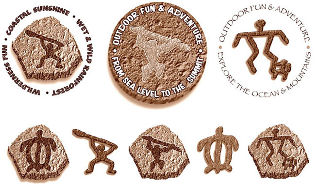
I found 3 petroglyph figures from a font of petroglyphs I have. I came up with 3 messages, & using a texture I got from scanning a piece of lava, I tried out 3 ideas of textured figure alone, on a disc, & on a rock shape. The client liked one of my textured glyphs, & emailed me this pic with his decision on wording & a suggestion for some kind of water, &/or waterfall, along with a sun.
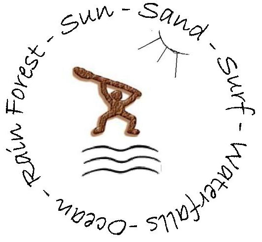
So, I came up with these few more designs with water, sun, color, & his wording.
I also picked out the font Papyrus as a possible choice for him.
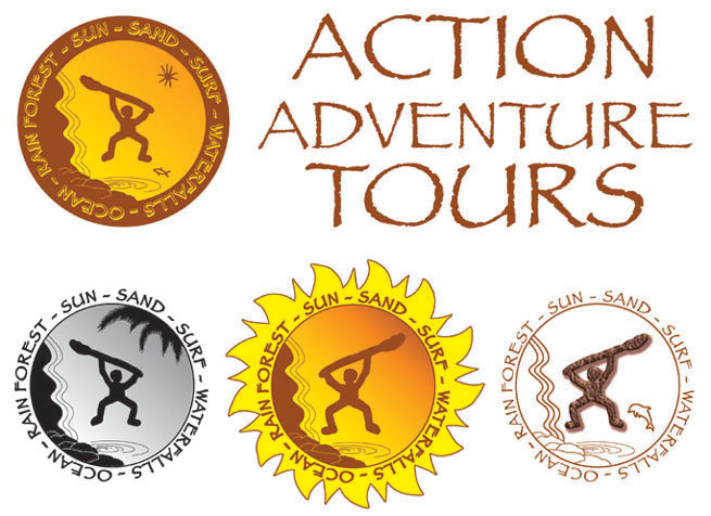
He liked the font choice, & the sun (ring of fire) He said he hates anything orange, but for some reason the greyscale image appeared blue on his screen, & he really liked the blue. He also said he loved my rocks & my pool of water, but the waterfall wasn’t working for him. He had initially stressed simplicity, so I tried out using his wavy lines, but they didn’t “work” for me either.
So then I sent him this with some blue choices for him, my own more colorful idea, & 3 new waterfall ideas. He had also asked for a dolphin, but I hoped I could talk him out of that. He was also having second thoughts about the glyph with paddle, & asked to see a petroglyph figure without the paddle.

At this point I had reminded him our first estimate was only a starting point, & not intended to include “unlimited” revisions. If the next round of revisions was very simple we would be able to stay within the original quote, but any further work would be at an additional expense. He loved the colored version, that waterfall, & the palm fronds. He was happy with the lettering for the company name from my previous submission, & the only change now was to put back the original glyph, & change the justification of the business name copy. This was the final logo I sent back:
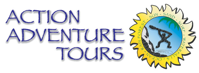
The sun rays were made from 2 different pieces of clip art, the basic shape of the glyph was from a font, & the rest was the creative process of communicating with my client & attempting to materialize his vision. He is extremely happy with it & has also told me of many incidents of very positive feedback he has received already.
He flew back in to Maui, paid the balance & took me to the dealership to see the trucks he expected to have within a few days & discuss designing truck graphics.
I charged him a design fee to draw up a 3-tier photo presentation with quotes. He picked what I considered to be the cleanest look, the upper left design of the four shown below.
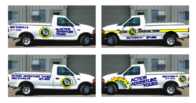
We rushed out the first truck in time for a photo shoot on the beach with their kayaks to be used on some flyers & brochures etc.
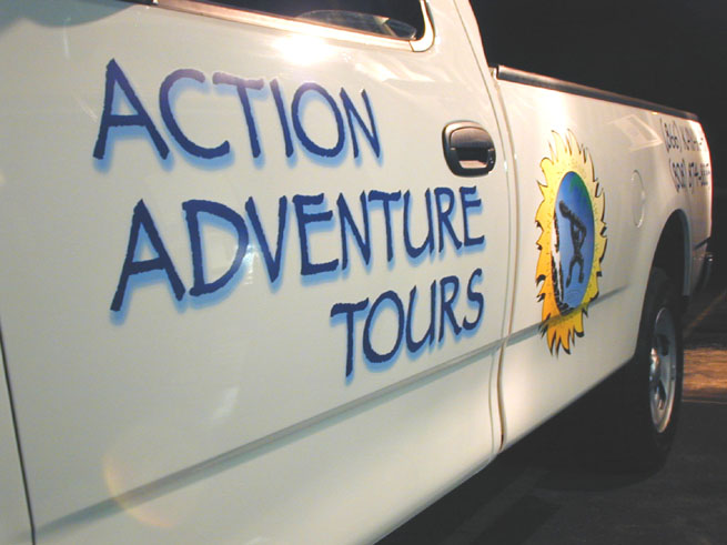
Here is a photo from the late night rush install:
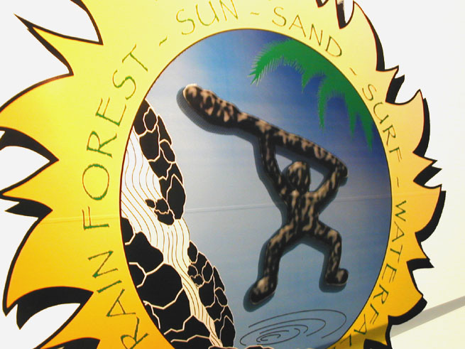
And one last closeup photo:
 Posted on April 20, 2009
 by Doug
  0
0